I wonder how many non-technical people like me now work from the terminal every day.
How we interact with technology has changed dramatically in the last twelve months.
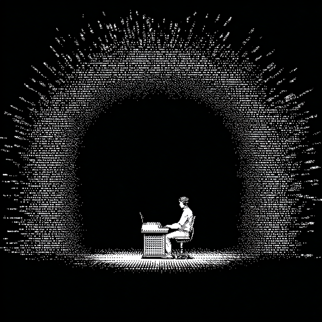
For so many knowledge workers, the day no longer starts inside the polished UI of an app. It starts in the text-heavy, retro interface of a terminal. Whether that's Claude Code, Codex, Cursor, or VS Code.
In some ways, it makes sense. Software was always a means to an end. A tool to get the job done. But somewhere along the way, we got so deep into building interfaces that the purpose got lost.
The fragmentation problem we never actually solved
Every knowledge industry has had a fragmentation problem. LegalTech included. Dozens of tools, each with its own UI, its own logins, its own way of doing things.
So we consolidated. Platforms ate point solutions, promising cleaner interfaces. Single sign-on. Unified dashboards. One pane of glass.
But the abstraction problem never went away. A consolidated UI is still a UI. It still asks the user to learn a model, navigate a hierarchy, click through a flow. The friction got prettier. It did not disappear.
Now something else is happening. The interface is becoming optional.
Through agentic workflows, voice (I cannot be the only one speaking more than I type), and MCP connections, software gets reached and acted on directly. The outcome gets delivered without anyone opening an app.
Ryan McDonough wrote about this recently, and the title alone is worth sitting with: "The interface is no longer the point."
He's right. And for anyone building software today, the question has shifted.
It's not: how do people use this?
It's: how many surfaces can this be reached from?
What disappears when the interface disappears
The thing worth sitting with is what we lose when the UI fades.
Interfaces did more than display data. They taught people the model. They created a place where ambiguous requests got disambiguated by clicking through a flow. They let designers slow people down at the right moment, for the right reason. They were also where trust got built, the small assurances of a confirmation screen, a preview, a list you could scan before committing.
When the entry point becomes a chat box or a voice command, that scaffolding goes with it. The user no longer learns by exploring. They learn by asking. And the burden of explaining what is possible shifts from the screen to the system itself.
That is a different design problem. It looks less like layout and more like vocabulary. Less like flows and more like guardrails. The tool has to know what it can do, what it should refuse, and how to make a good decision when the request is half-formed.
Most software was not built for that. Most teams are not staffed for that. The shift is bigger than a redesign.
Build for the surface area, not the screen
We thinking about this to enable work from web, mobile, Outlook, Claude, Perplexity, and more via MCP. Not because we want to be everywhere. Because the work happens everywhere, and the tool should follow.
The instinct used to be: own the workspace, own the user. Make the dashboard sticky enough that people lived inside it. The replacement instinct is harder. It is to make the underlying capability available wherever the work shows up, and to accept that the user might never see your logo.
That is a brand cost. It is also an honest one. The tools that win the next decade will be the ones that show up where the work already is, not the ones that demand the work move to them.
Software was never the point. The outcome was.
We are finally building like we know that.